
Lean organizations make far more use, and far more public use, of statistics and charts than do other organizations.
That’s good.
Quite often, however, in fledgling Lean organizations the information is presented in a way that tells a misleading story, or tells no useful story at all. These “statistics” sometimes seem like cartoon versions of what mass production managers believe Lean statistics should look like.
That’s bad.
In the worst cases such information in the hands of bad managers can lead to decisions that make no sense and are extremely costly to the business. Let’s take a look at some statistics and charts to see how the same data, presented differently — different chart type, different time line, and analyzed differently — can tell a very different story from the one a mass production chart can show.
Most data are presented something like this line graph, showing the progress of time along the horizontal axis (the “x-axis”) and the actual measurements — in this case, “Production” — on the vertical y-axis, with a “trendline” thrown in to look more official:
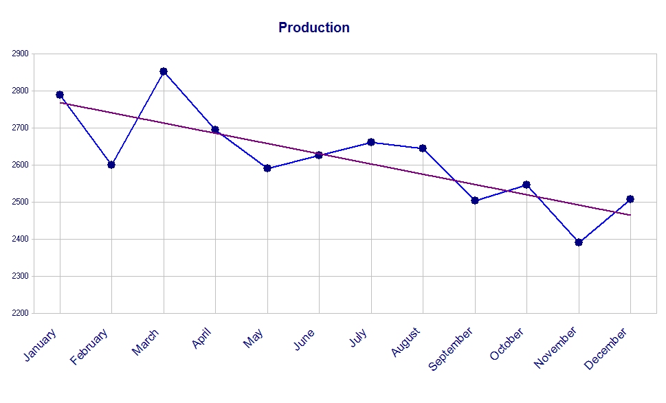
At first glance this seems like a reasonable presentation, but a careful evaluation of the data shows a lot of problems with this chart.
I saw a chart like this once and asked the production manager why there seemed to be so much variation in the production. “That’s how many orders we got,” came her reply.
“So this isn’t really a chart of production,” I proposed to her, “but a chart of orders, or really a chart of customer demand. Is that right?”
At first she wasn’t having any of it. She had become locked into thinking about that data and that chart in a particular way and couldn’t think about the information in a different way. This was through no fault of her own; we are all like this to some degree, which should serve as a warning not to be excessively confident of our own knowledge. A little humility helps.
Finally I proposed to her a different chart. What if we plotted not ‘Production’ but the percentage of orders that were completed within three days of receipt? What would that look like?
She thought about it for a bit and replied “Most orders are produced within three days of receipt, so it would be an almost flat line.”
“Most orders? Why most?”
“Well, sometimes we get a spike in orders and, even working overtime, we can’t get them out in three days.”
“So what you’re saying is that in most cases production keeps pace with the rate of customer demand, but when it doesn’t, it’s because there is a spike in customer demand. So basically what’s really driving the variation in this ‘Production’ chart is the variation in the rate of customer demand, not some inherent variation in the production process. Right?”
“Well, I suppose…”
“If that’s the case it seems to me the chart should really be labeled ‘Customer Demand’, not ‘Production’.” She finally saw the light.
Now our chart looks like this:
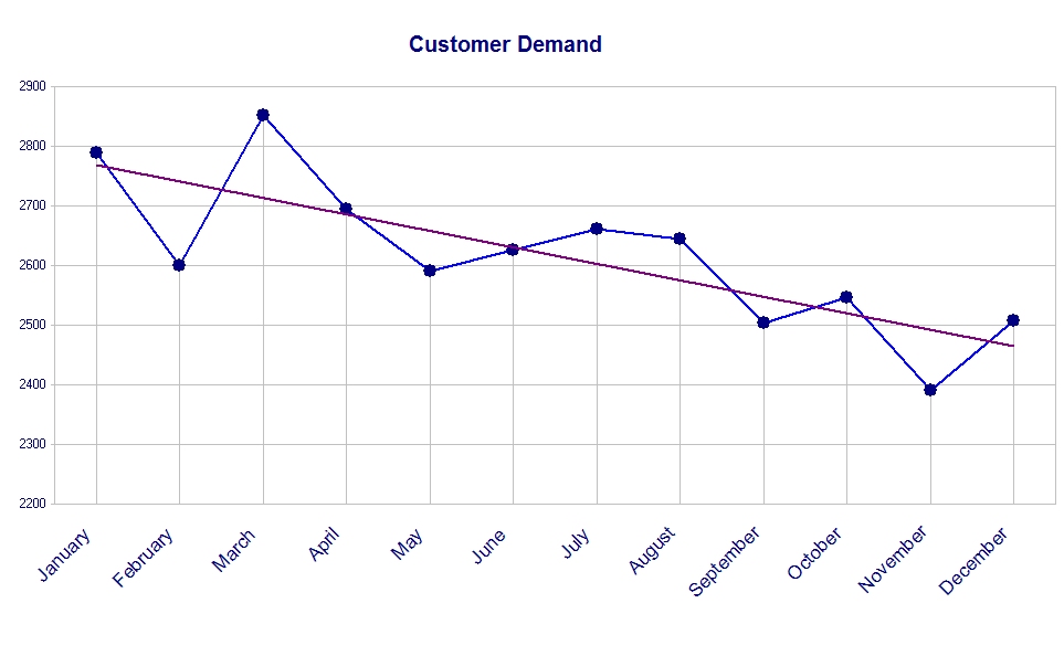
It’s the same chart except for the chart title, but already it tells a very different story. This second chart is a more accurate portrayal of what is happening, but there are still problems with it.
A line graph suggests to the viewer some continuity between data points. As a production chart a line graph is probably fine. We often want to know why we were able to produce 2,853 items in March, but only 2,694 items in April. A line segment pointing in the wrong direction (upper left to lower right) helps us spot this decline in production.
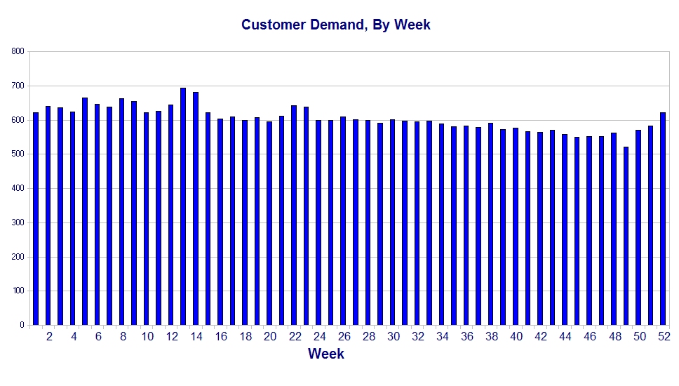
However, this isn’t a chart of production. It’s a chart of customer demand. In most cases the quantities that customers demand this month are completely independent of the quantities that customers demanded last month. Since the rate of demand isn’t linked month-to-month, we shouldn’t connect those data points with a line. Don’t use a line graph. For this case, use a bar graph:
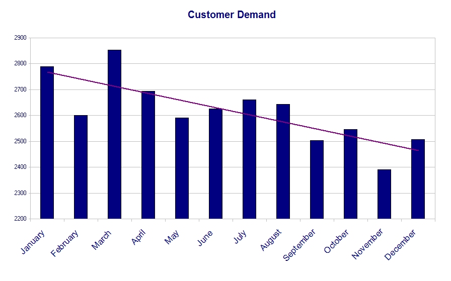
This is an improvement, but we still have problems. For example, it appears that there is a lot of variation. But is there?
It’s actually hard to tell because we are only looking at the tops of the bars. I would suggest using a chart with the y-axis starting at zero instead of at 2,200:
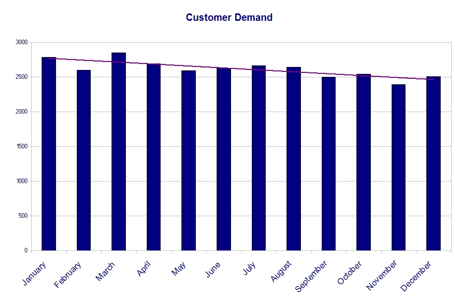
With more complete information this chart offers a better perspective on the amount of variation in customer demand. This technique of providing more complete information by starting the vertical axis at zero isn’t a hard and fast rule. Either case may be useful, and you might use them together, but you should have a good reason for using whichever method you choose.
There is yet another obvious problem with this chart: It really is too coarse to provide much useful information. Sure, we know customer demand per month, but so what? Can we really do anything with that? Months have different number of days, and different numbers of work day every year, so the measurement basis of the data is constantly varying. For example, the number of work days in the longest month of the year can be 15% greater than the number of work days in February, except in a leap year. You can see the problem. Clearly you can build a lot of variation into your data if you tabulate it on a monthly basis.
Tabulating data on a weekly basis involves using essentially the same data, and also has problems with inherent variation (Thanksgiving, Christmas, Independence Day, Memorial Day, etc), but I find it more manageable. In a case like this I believe weekly data is more useful:
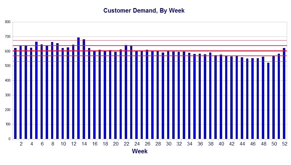
Notice that this version of the chart left out one more glaring problem. That problem is what is often called the ‘trendline’, but is properly called the regression line. It’s properly called a regression line because it is a regression line, and we ought to get accustomed to using the proper terms and thought processes associated with these statistics.
However, a regression line in this particular chart is essentially meaningless because virtually every business has cycles to it. Those cycles negate the effect of a short-term trendline.
Think about it like this: Suppose a business has exactly the same business cycle year after year. By this I mean whatever is being measured shows periodic increases and decreases during the year, but each year is just like the one before it and just like the one after it. Now we randomly insert a regression line into one cycle or a part of a cycle of that inherently cyclical data. Depending on where in the cycle our chart starts, the regression line can point up (good) or down (bad), all based on exactly the same data. When the same data can give you different results based on where you start plotting that data, you have a problem.
Unfortunately, many self-described goal-focused result-oriented managers who motivate their team and hold them accountable (and use other buzz words ad nauseam) are unwilling or unable to comprehend the problem with a random regression line (an oxymoron if there ever was one). It can be really dangerous to put a useless line into a chart like this and put that chart into the hands of such people. If you have reliable cyclical data it is possible to normalize one cycle against many cycles, but you need good software and really have to know what you are doing to pull that off.
In any case, I don’t believe a regression line is really appropriate here.
What is appropriate is a different set of statistics: The mean and the standard deviation. Together these numbers can give us some insight into the rates of customer demand, what the company must do to reliably meet that demand, and how well the company is doing in meeting those demands. Now we are getting into the real reason to measure and chart such information — so we can actually have useful information with which to run the business.
But what do “mean” and “standard deviation” mean?
The mean is simply what most people call the average.
The standard deviation is a measure of how much a set of data points is different from — or “deviates” from — the mean. Knowing the average rate of customer demand and how much the demand tends to vary from that average will allow us to predict the maximum probable demand, and set up our operations to meet that maximum probable demand.
Under certain circumstances (i.e., the data is “normally distributed”, that is, can be plotted under the well-known bell-shaped curve) about 2/3 of all data points (actually 68.27%) will be within one standard deviation of the mean. Under the same circumstances (when the data is normally distributed) 95% of all data will be within two standard deviations of the mean.
This is what the mean and standard deviation look like on our chart:
There is still a problem with this chart. It would probably be fine as a hard copy, but the magic of .JPG files compresses the file so much that the lines become blurred and it’s difficult to read. Let’s take a step back and look at just the upper section of the chart to see what it shows:
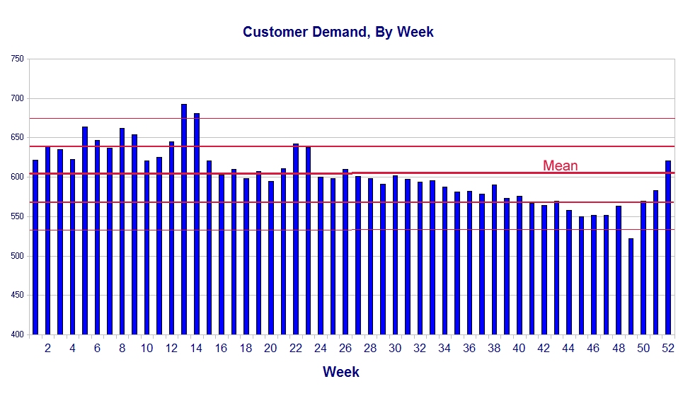
Here we can see better the mean of customer demand and the lines representing one and two standard deviations above and below the mean for customer demand. A wise manager would use this information to design the production system for a capacity of, at a minimum, the mean (604 parts per week) plus two standard deviations (2 time 35.4, or about 71), or a total of about 675 parts per week. If we do that, most of the time — about 50 weeks out of 52 — we will be able to meet the rate of customer demand without a lot of trouble.
Compare this final chart with the “Production” chart at the beginning of this article.
This final chart gives fairly good insight into what is actually happening with the rate of customer demand. It can help us design our production system so it becomes stable and largely predictable, and able to meet customer demand in most circumstances.
The chart with which we started, on the other hand, though drawn from the same basic information, tells us nothing useful. In fact, because it pretends to show a downward trend in production, it seems to suggest there are problems in the production process.
In fact, there is no evidence either for or against problems in the production process. When you recall that, statistically speaking, half of all managers are below average, you can see the danger of putting a chart like the original into the hands of some managers. Bad data, or bad interpretation of good data, can be worse than no data at all, but good data and charts can will give you a distinct advantage over your competition. That’s why it behooves you to learn to make and read good charts.